Unico facelift
Branding
Design
Art Direction
Branding
Design
Art Direction
Unico's facelift project was born out of the brand's need to stand out from the competition and become more scalable and consistent across all user touchpoints.
![]()
It was also an opportunity to create foundations and a visual narrative that translates all the brand's principles and values into a real, strong objective that guides the entire creation:
"Help people find their own identity by changing their relationship with services that improve their lives."
![]()
This means connecting with users in a simple and transparent way, handling people's data responsibly, creating trusting relationships between people and companies, and changing Brazilians' relationship with their data by focusing on education.
All this was translated into our brand manifesto with the help of Tátil Design:
All these improvements to our positioning are also reflected in the way the brand expresses itself verbally and visually. In doing so, we relied on the help of OTO and Doma02 by Plau, who helped us bring Unico to the world:
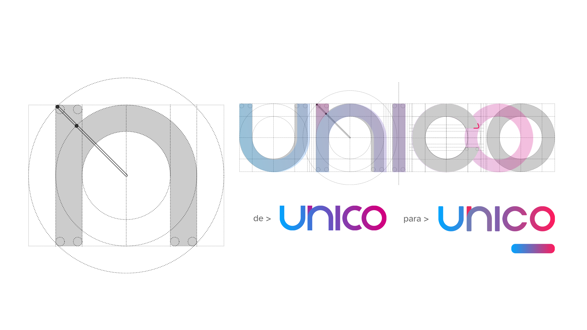
The work on the brand evolution, which went through several phases, was based on a warmer, closer look at a technology brand. To this end, the first phase of this project involved revising our logo.
![]()
We made minimal adjustments to better represent our values and look, a more circular, friendly and balanced brand that puts the user at the center.
![]()
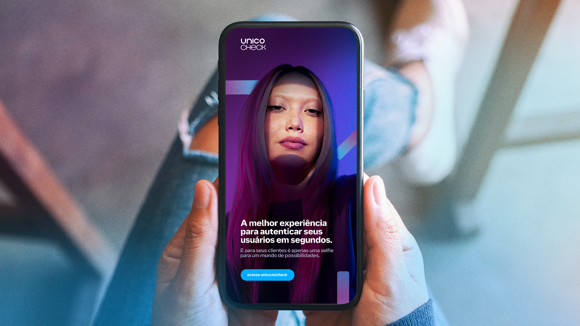
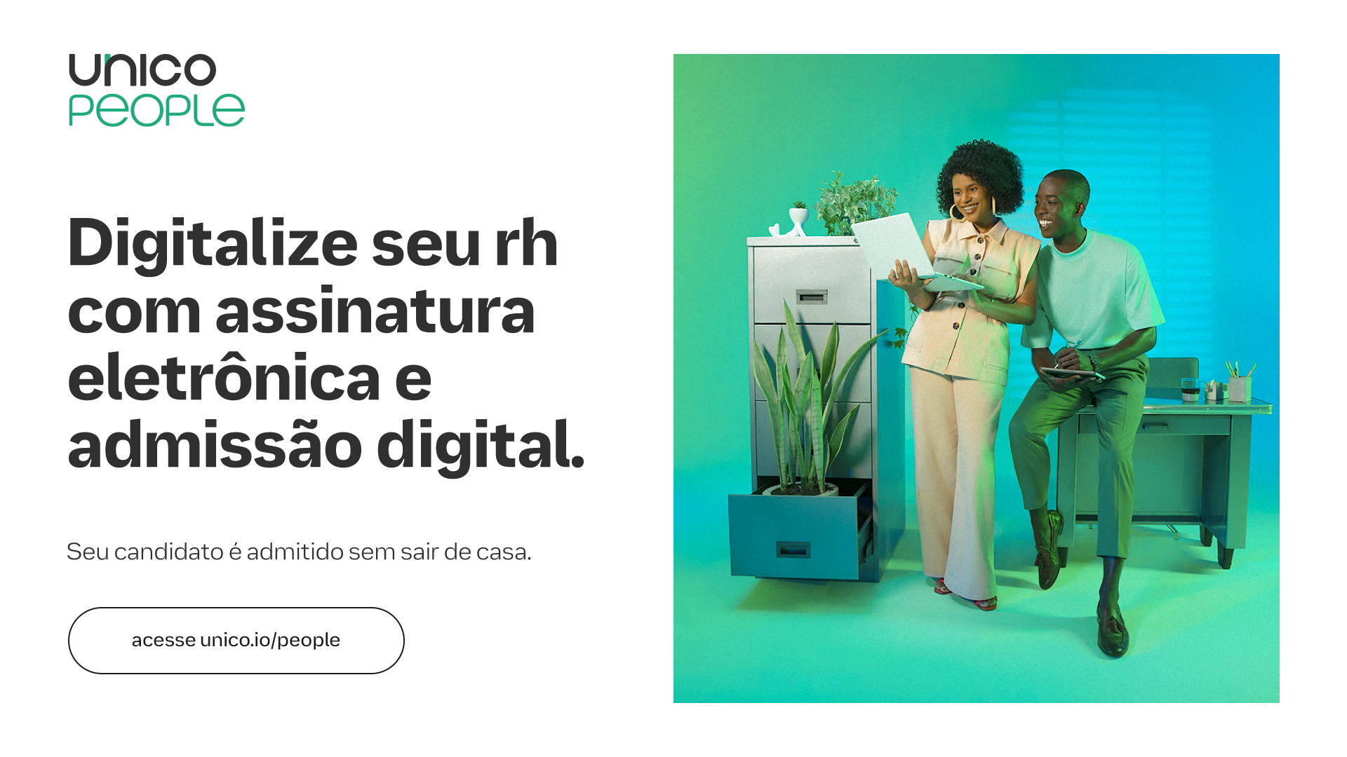
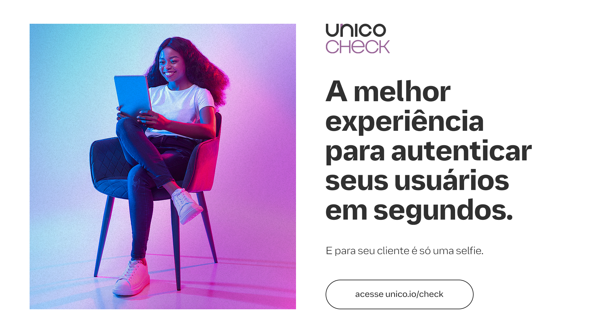
The adjustments in colors and gradients were to create a stronger identification with the brand. We brought back warmer and more pleasing tones to the eyes and broke away from the neon palette that is popular in the tech world. All the colors had a lower incidence of light and brightness, simulating the color and grain of printing on paper.
![]()
![]()
![]()
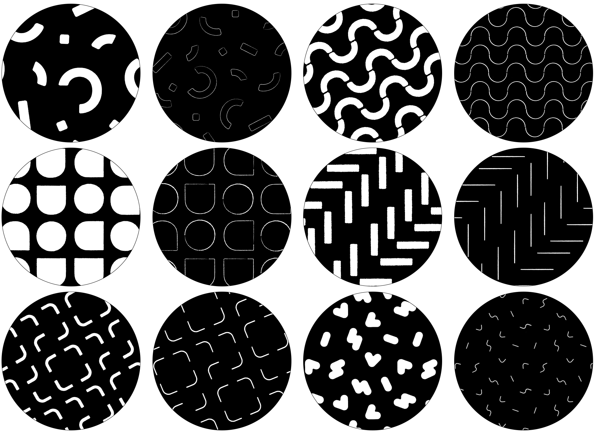
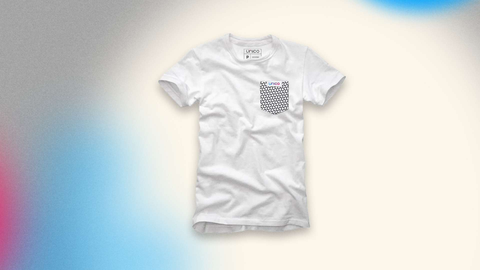
And since our field is security and de-bureaucratization, we took this into consideration when designing our own graphics and patterns. Our graphics save the value and authenticity of the stamp in documents, its lines have natural deformations inspired by the leakage of ink when stamping a sheet of paper.
![]()
Our patterns are inspired by the security lines and watermarks found in banknotes and special documents, such as birth certificates.
![]()
![]()
![]()
![]()
![]()
![]()
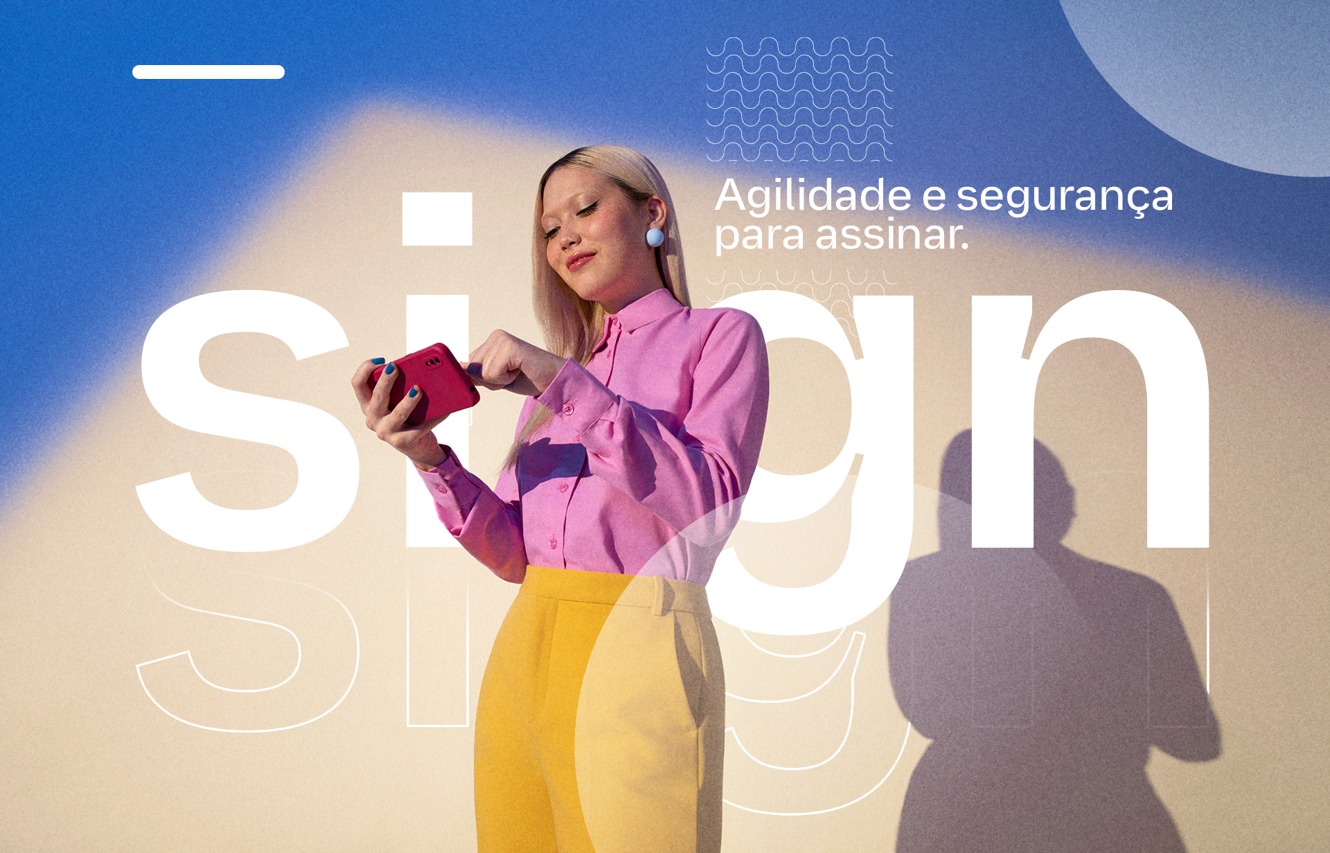
Our type is literally handmade. And it's done by four hands. A project that involved the branding team, the Unico product team, OTO and Plau to develop a proprietary and scalable typeface.
With an eye for accessibility, the entire project was managed to meet minimum legibility requirements while producing a type family with personality.
![]()
Unico Logotipo Font, an exclusive font to reinforce the brand architecture of Unico products through scalability and efficiency.
Unico Display Font, a font that revives Inktraps - a resource that intentionally creates voids in type to avoid the problem of ink leakage in old printers; these voids acted like a natural ink catcher in the paper itself - with much more personality for titles.
![]()
![]()
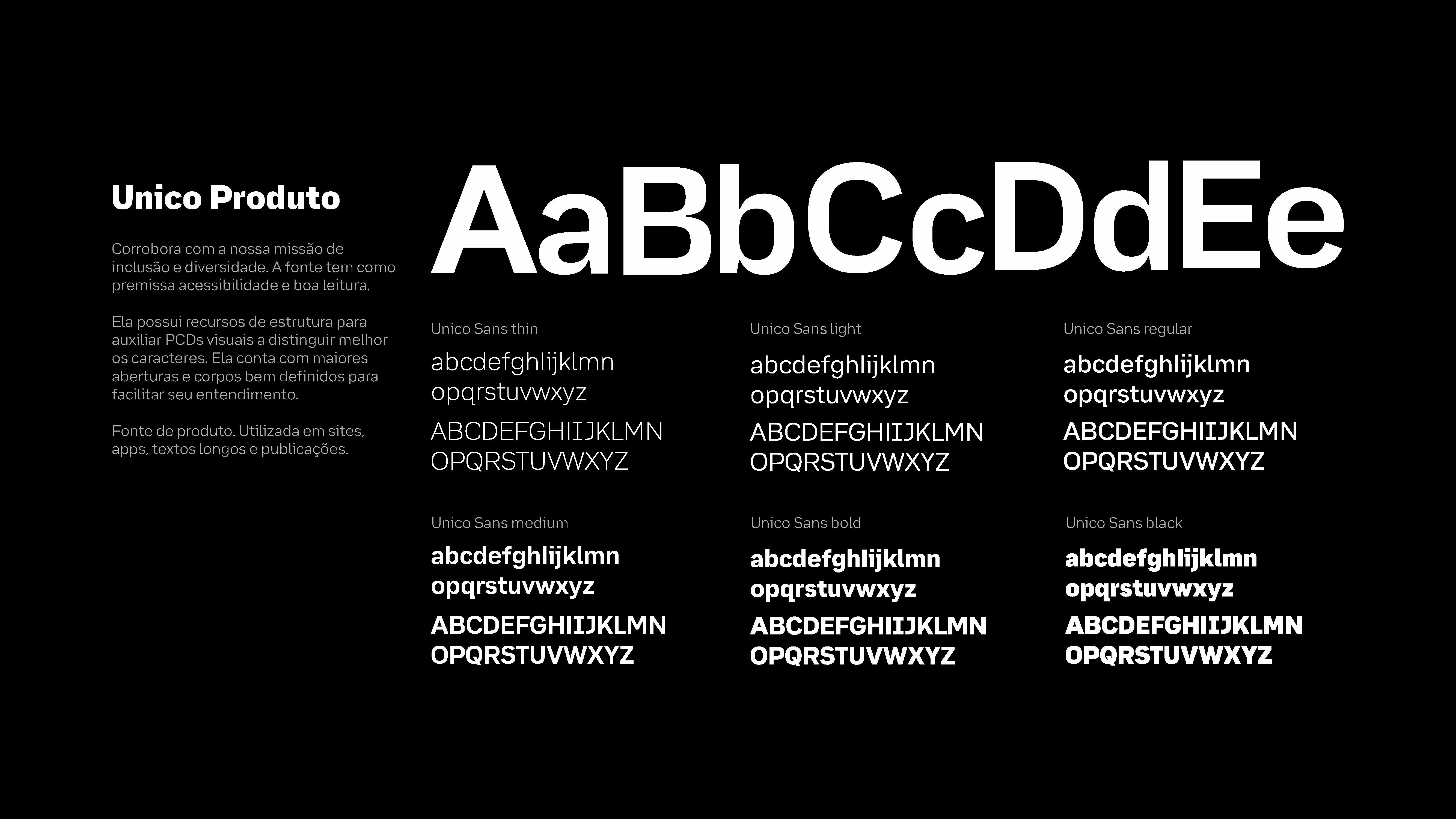
Unico Product Font , an extremely accessible typeface inspired by Atkinson Hyperlegible, with visual resources to facilitate reading, such as the use of serifs to distinguish similar characters like "p" / "q" and more open angles and well-designed bodies to facilitate assimilation and understanding of the characters when used together.
![]()
![]()
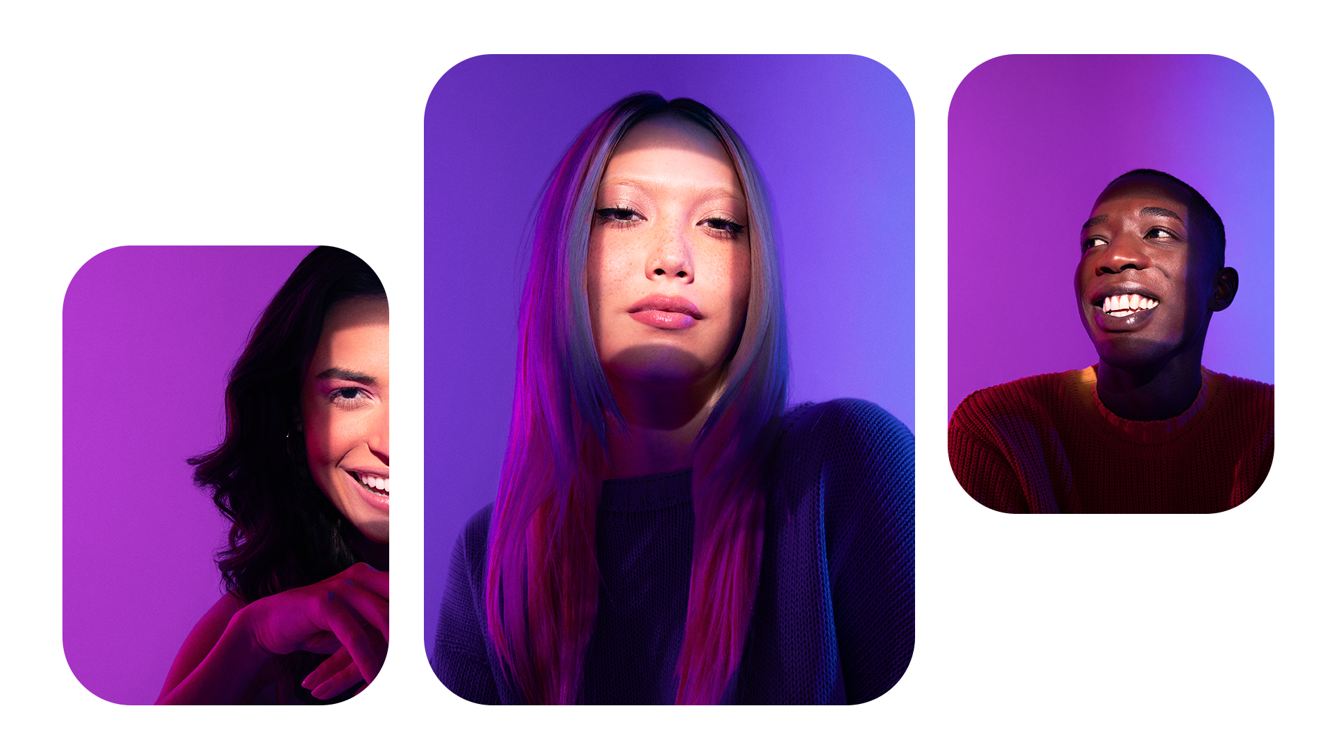
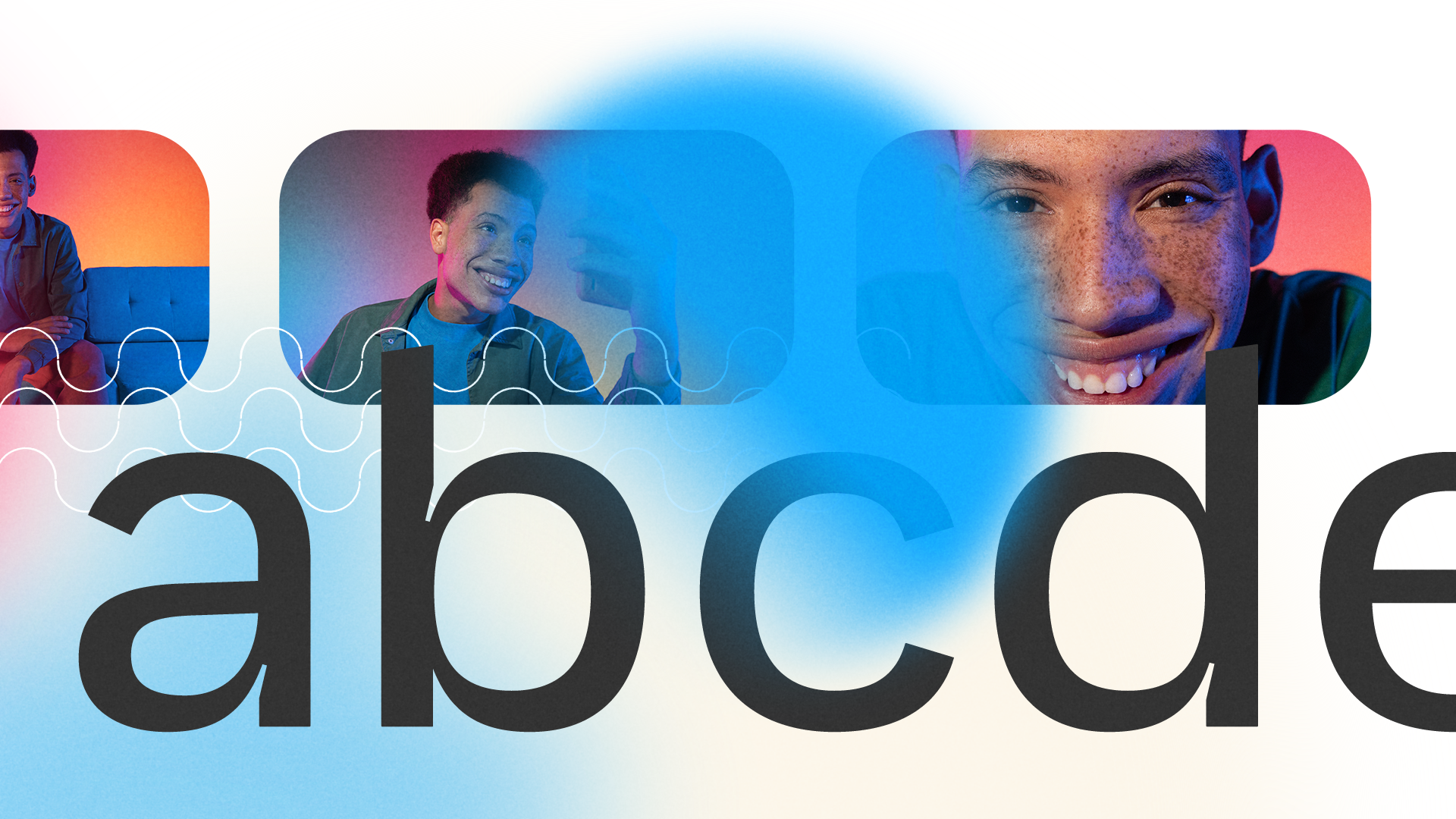
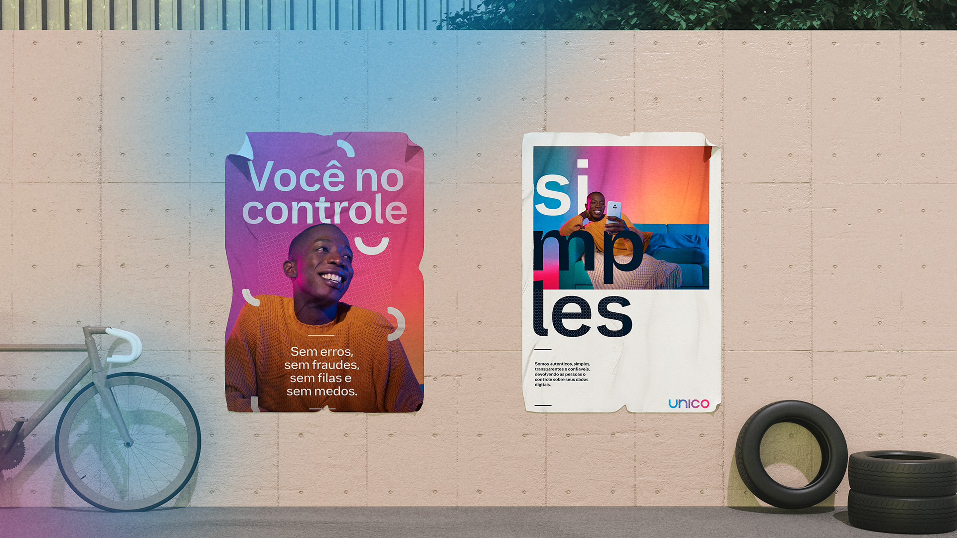
In addition, we also produce our own shooting to transfer our appearance into unique beings. The process of facial biometrics is only possible because this individuality of beings, the distance of eyes and mouth, skin color, shapes and birthmarks, our face is our most complex document. For this, we broke with some market standards and did away with objects and scenarios to tell more by showing less.
![]()
![]()
![]()
![]()
![]()
![]()
It was also an opportunity to create foundations and a visual narrative that translates all the brand's principles and values into a real, strong objective that guides the entire creation:
"Help people find their own identity by changing their relationship with services that improve their lives."
This means connecting with users in a simple and transparent way, handling people's data responsibly, creating trusting relationships between people and companies, and changing Brazilians' relationship with their data by focusing on education.
All this was translated into our brand manifesto with the help of Tátil Design:
All these improvements to our positioning are also reflected in the way the brand expresses itself verbally and visually. In doing so, we relied on the help of OTO and Doma02 by Plau, who helped us bring Unico to the world:
The work on the brand evolution, which went through several phases, was based on a warmer, closer look at a technology brand. To this end, the first phase of this project involved revising our logo.

We made minimal adjustments to better represent our values and look, a more circular, friendly and balanced brand that puts the user at the center.
The adjustments in colors and gradients were to create a stronger identification with the brand. We brought back warmer and more pleasing tones to the eyes and broke away from the neon palette that is popular in the tech world. All the colors had a lower incidence of light and brightness, simulating the color and grain of printing on paper.
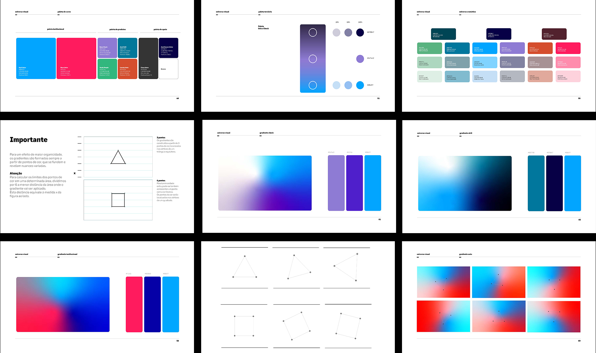
And since our field is security and de-bureaucratization, we took this into consideration when designing our own graphics and patterns. Our graphics save the value and authenticity of the stamp in documents, its lines have natural deformations inspired by the leakage of ink when stamping a sheet of paper.
Our patterns are inspired by the security lines and watermarks found in banknotes and special documents, such as birth certificates.


Our type is literally handmade. And it's done by four hands. A project that involved the branding team, the Unico product team, OTO and Plau to develop a proprietary and scalable typeface.
With an eye for accessibility, the entire project was managed to meet minimum legibility requirements while producing a type family with personality.
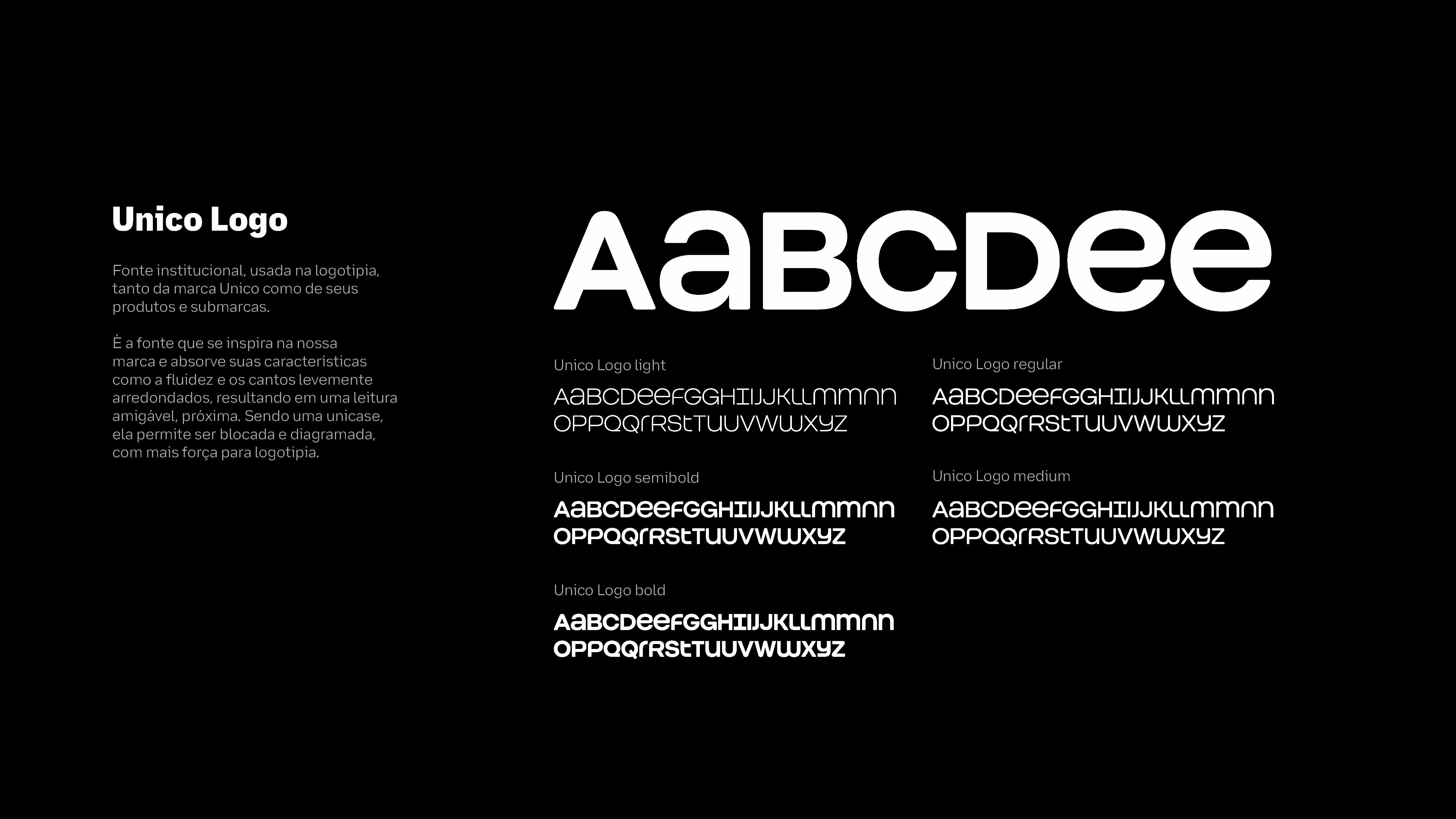
Unico Logotipo Font, an exclusive font to reinforce the brand architecture of Unico products through scalability and efficiency.
Unico Display Font, a font that revives Inktraps - a resource that intentionally creates voids in type to avoid the problem of ink leakage in old printers; these voids acted like a natural ink catcher in the paper itself - with much more personality for titles.


Unico Product Font , an extremely accessible typeface inspired by Atkinson Hyperlegible, with visual resources to facilitate reading, such as the use of serifs to distinguish similar characters like "p" / "q" and more open angles and well-designed bodies to facilitate assimilation and understanding of the characters when used together.

In addition, we also produce our own shooting to transfer our appearance into unique beings. The process of facial biometrics is only possible because this individuality of beings, the distance of eyes and mouth, skin color, shapes and birthmarks, our face is our most complex document. For this, we broke with some market standards and did away with objects and scenarios to tell more by showing less.


Unico Brandhub com o apoio dos parceiros: OTO, Tátil, Consoante, Plau e Doma02.
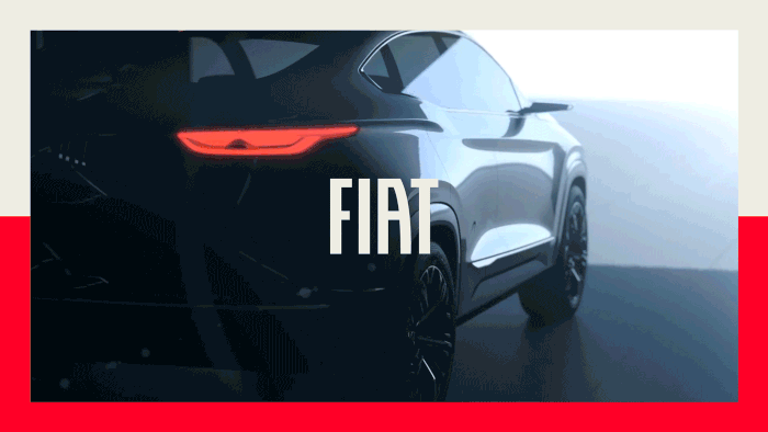
FIAT RE-Branding
Branding
Design
Art Direction
Branding
Design
Art Direction
One of the most popular and well-known brands in Brazil, market leader for 11 years, faced declining sales in the industry and changing consumer behavior, which led to audience disappointment and weakened the brand's bond with people.
![]()
In this scenario, we took the path of these challenges: highlighting the purpose of FIAT; clarifying the company's direction without leaving room for different interpretations; restoring close and trusting relationships between the brand and its audience; giving new meaning to the emotional bonds Fiat has built with consumers; creating an evocative and attractive visual universe to reawaken consumer desire; having communication that goes beyond the product itself and shares its vision of the world.
![]()
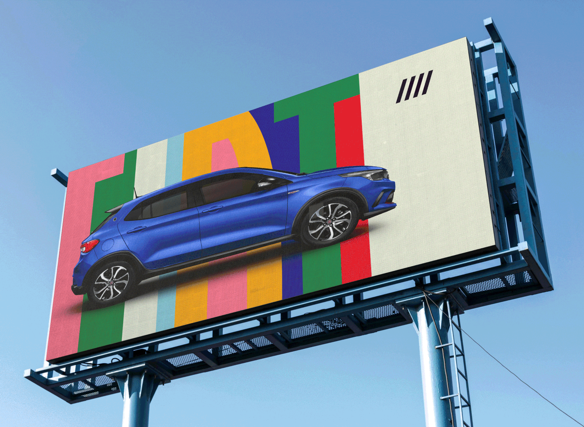
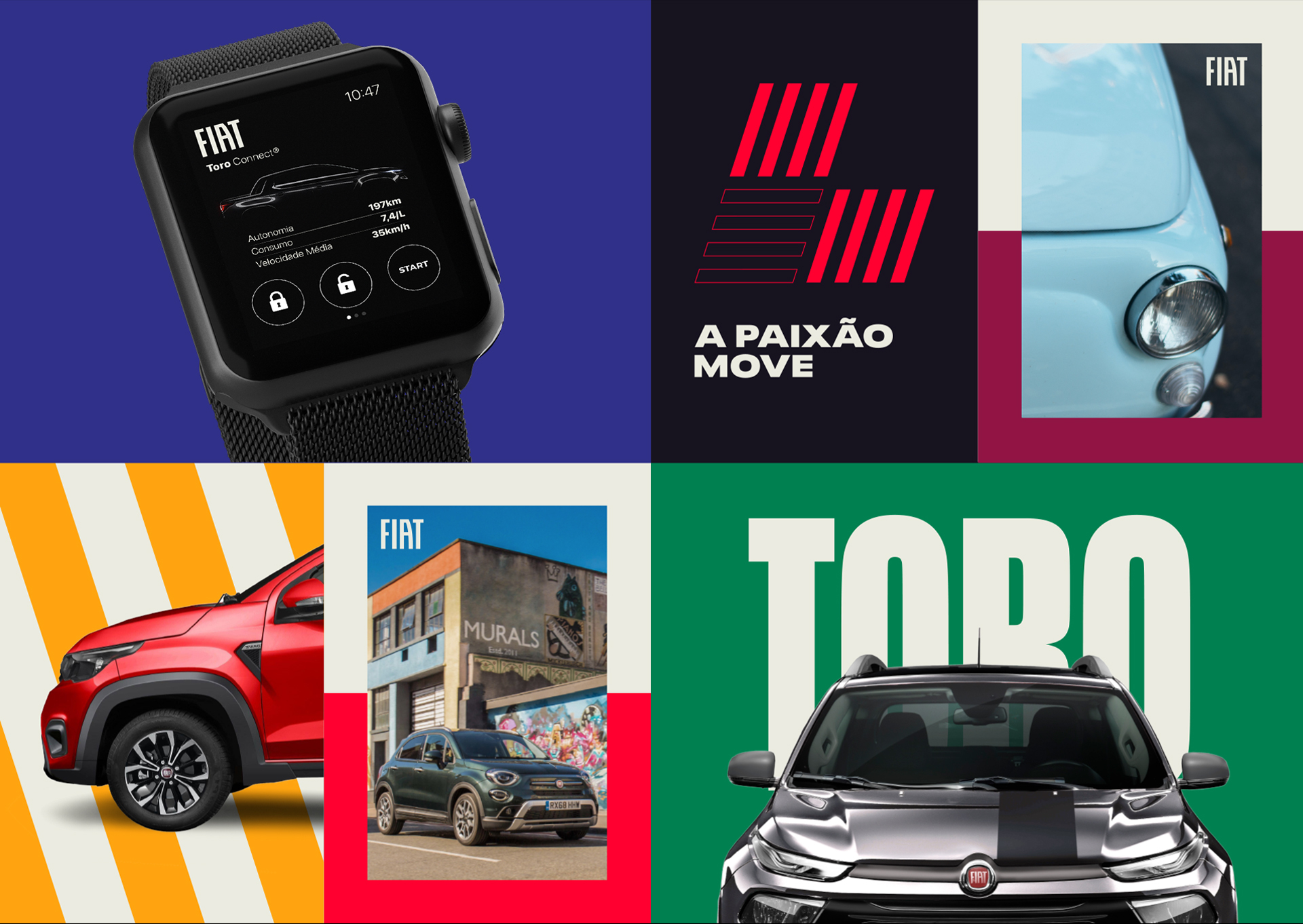
A brand with Italian origins and a track record in Brazil is the only one in the market that can speak and communicate its half-Italian and half-Brazilian personality, which is poppy, charming and spontaneous.
With FIAT we explored the cool side, to be on the streets, everywhere, as a democratic brand. Pop, a brand that knows how to connect with everyone and knows what's going on in pop culture.
![]()
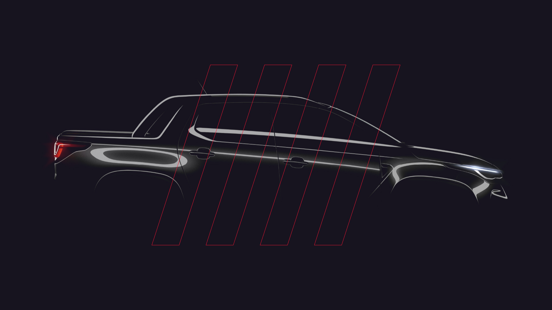
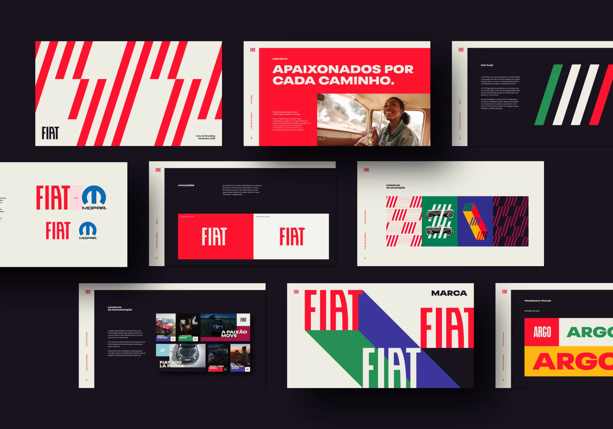
We also rescued an icon from Fiat's history and updated it in a contemporary way: the FIAT flag, a tribute to the Italian flag that frees itself from caricatures and expands the visual universe of the brand, going beyond the product itself.
![]()
![]()
![]()
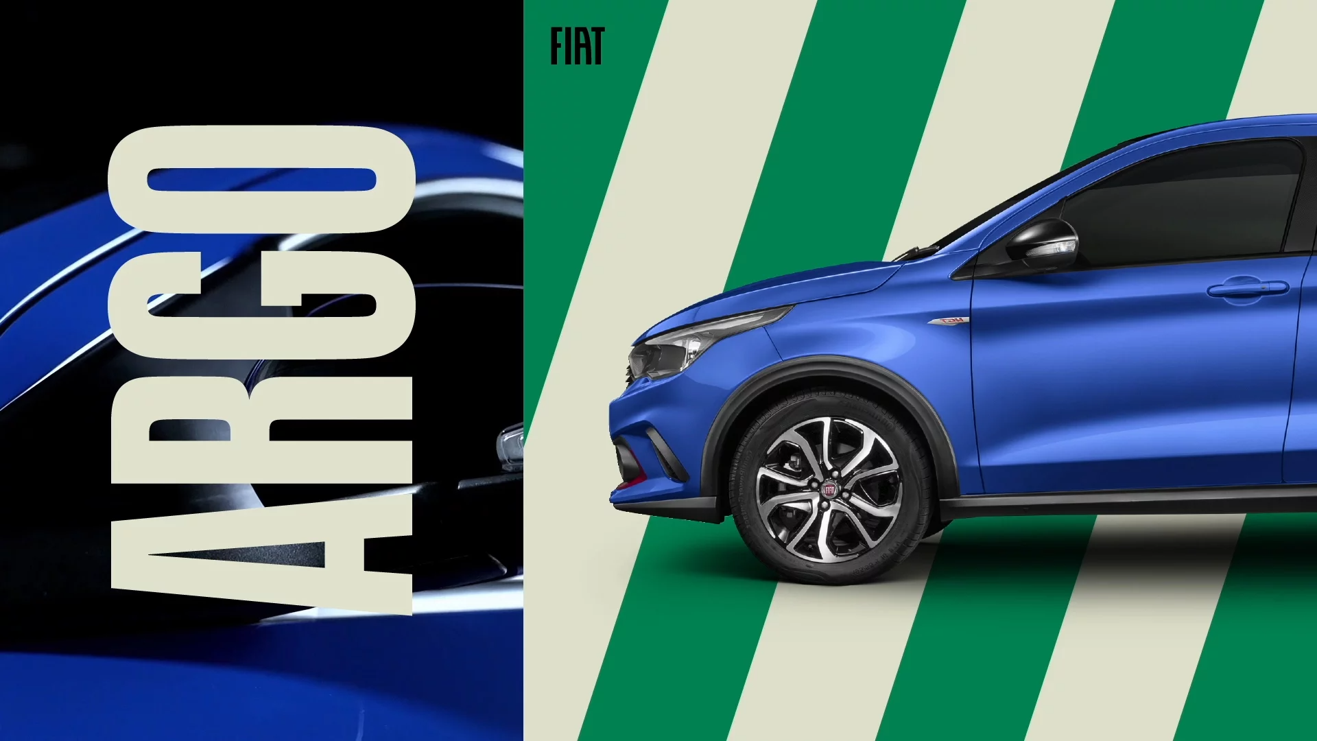
All the strategic and creative work was aimed at consolidating FIAT as a brand that goes far beyond the automotive market and has the potential to be even more part of people's lives at different times, forging different partnerships, whether with coffee or clothing brands.
![]()
![]()
![]()
![]()
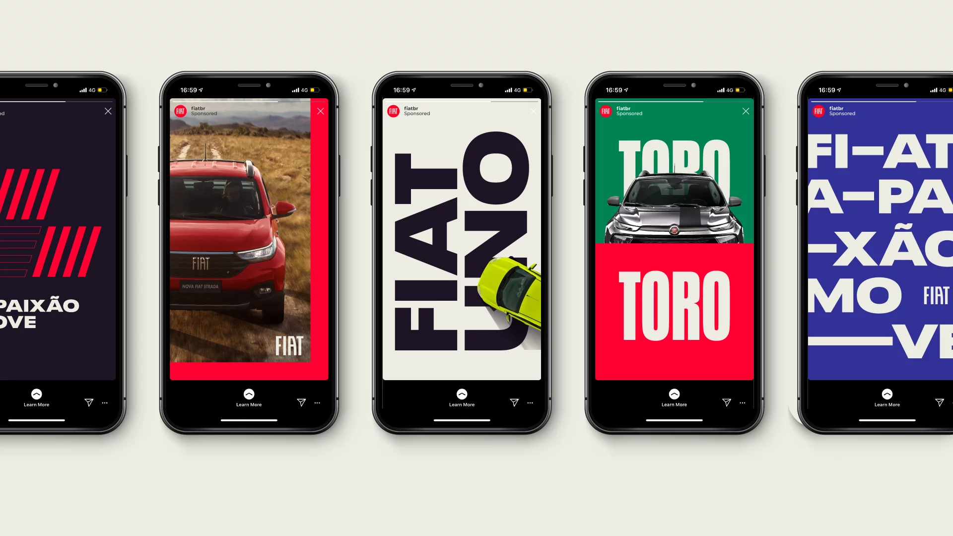
All creative work was designed to be scalable and executed consistently by FIAT 's communications partners and agencies, regardless of discipline, media or format.
![]()
![]()
![]()
![]()
![]()
![]()
In this scenario, we took the path of these challenges: highlighting the purpose of FIAT; clarifying the company's direction without leaving room for different interpretations; restoring close and trusting relationships between the brand and its audience; giving new meaning to the emotional bonds Fiat has built with consumers; creating an evocative and attractive visual universe to reawaken consumer desire; having communication that goes beyond the product itself and shares its vision of the world.
A brand with Italian origins and a track record in Brazil is the only one in the market that can speak and communicate its half-Italian and half-Brazilian personality, which is poppy, charming and spontaneous.
With FIAT we explored the cool side, to be on the streets, everywhere, as a democratic brand. Pop, a brand that knows how to connect with everyone and knows what's going on in pop culture.
We also rescued an icon from Fiat's history and updated it in a contemporary way: the FIAT flag, a tribute to the Italian flag that frees itself from caricatures and expands the visual universe of the brand, going beyond the product itself.


All the strategic and creative work was aimed at consolidating FIAT as a brand that goes far beyond the automotive market and has the potential to be even more part of people's lives at different times, forging different partnerships, whether with coffee or clothing brands.


All creative work was designed to be scalable and executed consistently by FIAT 's communications partners and agencies, regardless of discipline, media or format.


Agency:Ana Couto
NETFLIX IN THE COPA
ACTIVATION
CAMPAIGN
DIGITAL
PR
ACTIVATION
CAMPAIGN
DIGITAL
PR
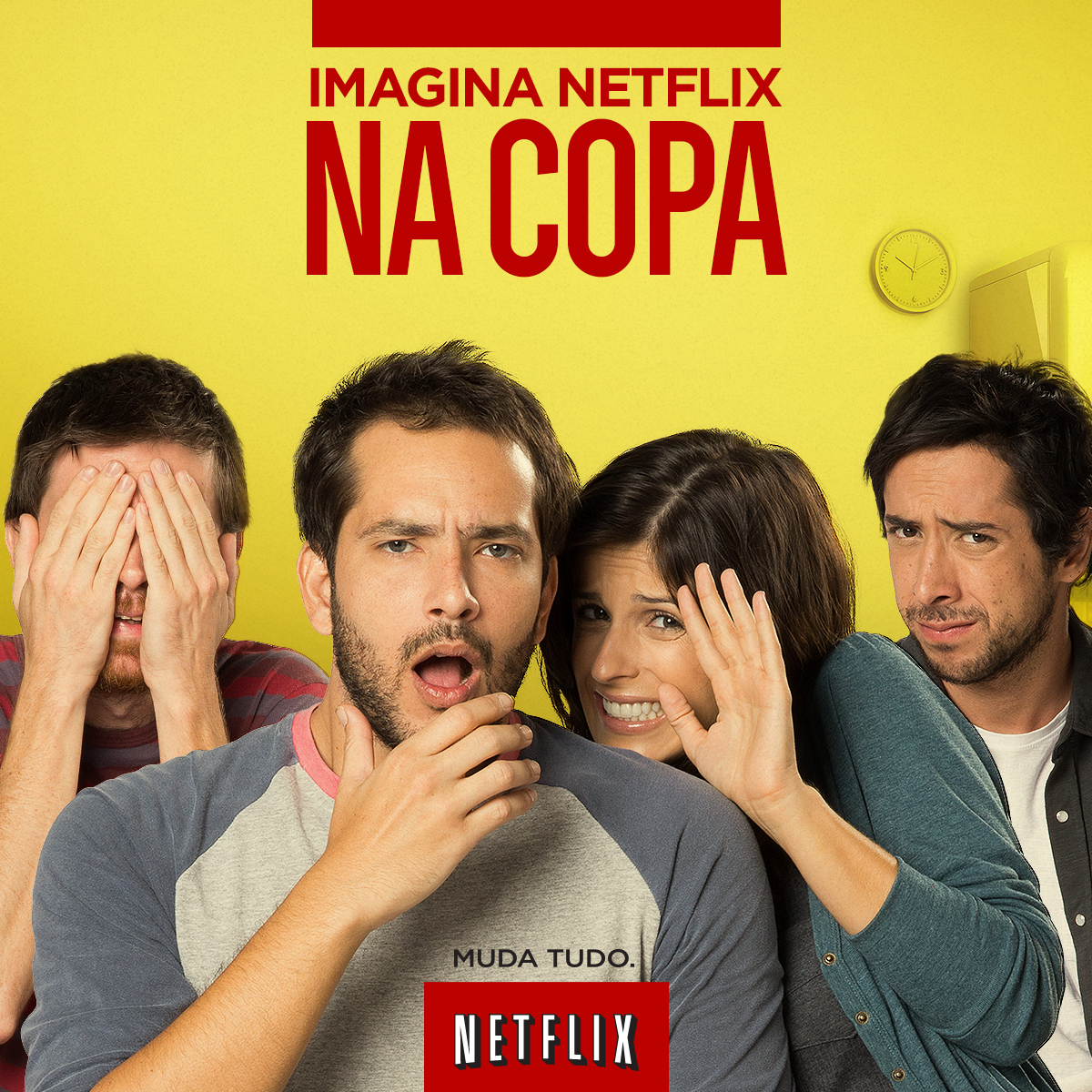
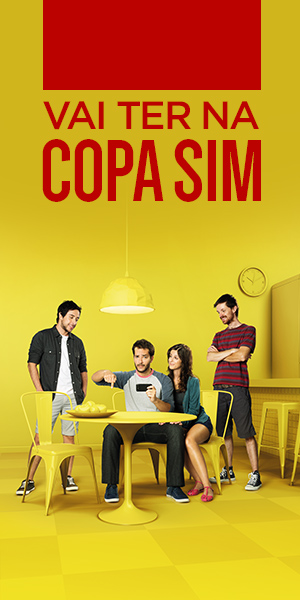
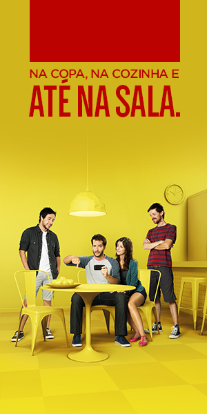
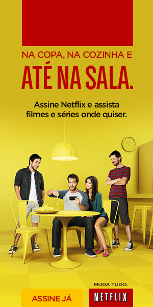
In times of the World Cup, FIFA has very clear, strict and incisive rules for the use of the event's assets, including the name "World Cup," especially for commercial use, which is reserved exclusively for the event's sponsors.
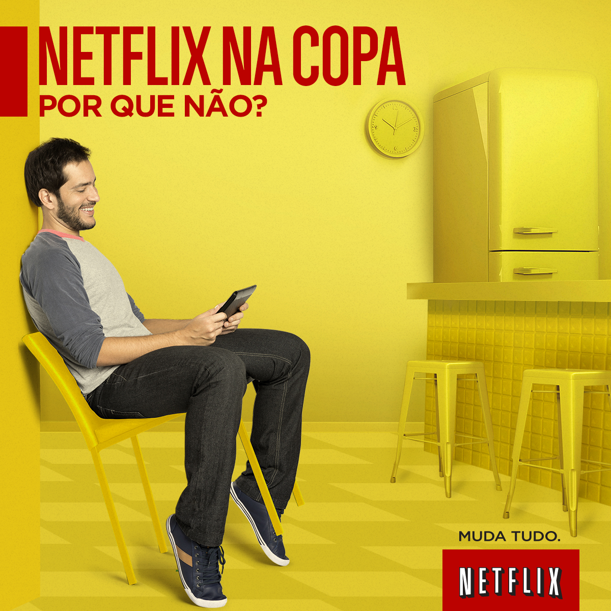
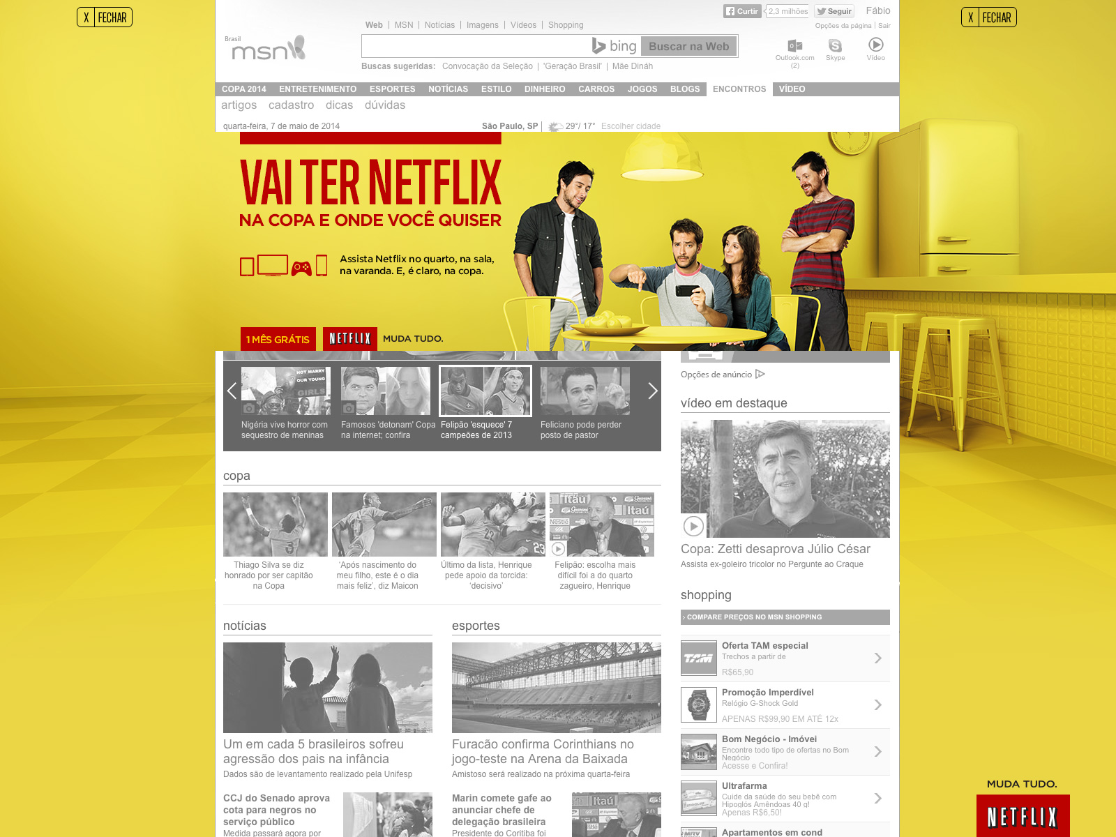
But in Portuguese, the word "Copa" means two things: the World Cup and also the kitchen where we all prepare our daily meals. So we had the idea to bypass Fifa and make a "Copa" ad for Netflix, a non-World Cup sponsor.
![]()
At the World Cup in Brazil, Brazilians were watching Netflix on the "Copa" (or in the kitchen, if you do not want to have problems with FIFA).
But in Portuguese, the word "Copa" means two things: the World Cup and also the kitchen where we all prepare our daily meals. So we had the idea to bypass Fifa and make a "Copa" ad for Netflix, a non-World Cup sponsor.

At the World Cup in Brazil, Brazilians were watching Netflix on the "Copa" (or in the kitchen, if you do not want to have problems with FIFA).
/// The Campaign was also a huge sucess on Social and Display ///


Agency: VML Brazil
Creative Direction: Wellington Ferreira, Jairo Anderson e Silmo Bonomi.
Art Direction: Wellington Ferreira and Fábio Lemos.
Copy:Jairo Anderson, Thiago Costalonga, Alejandro Gumucio and Mariana Albuquerque.
Creative Direction: Wellington Ferreira, Jairo Anderson e Silmo Bonomi.
Art Direction: Wellington Ferreira and Fábio Lemos.
Copy:Jairo Anderson, Thiago Costalonga, Alejandro Gumucio and Mariana Albuquerque.
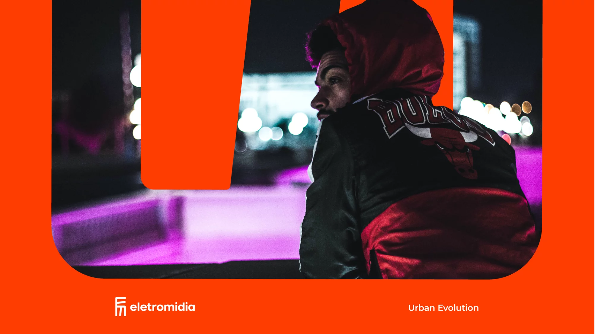
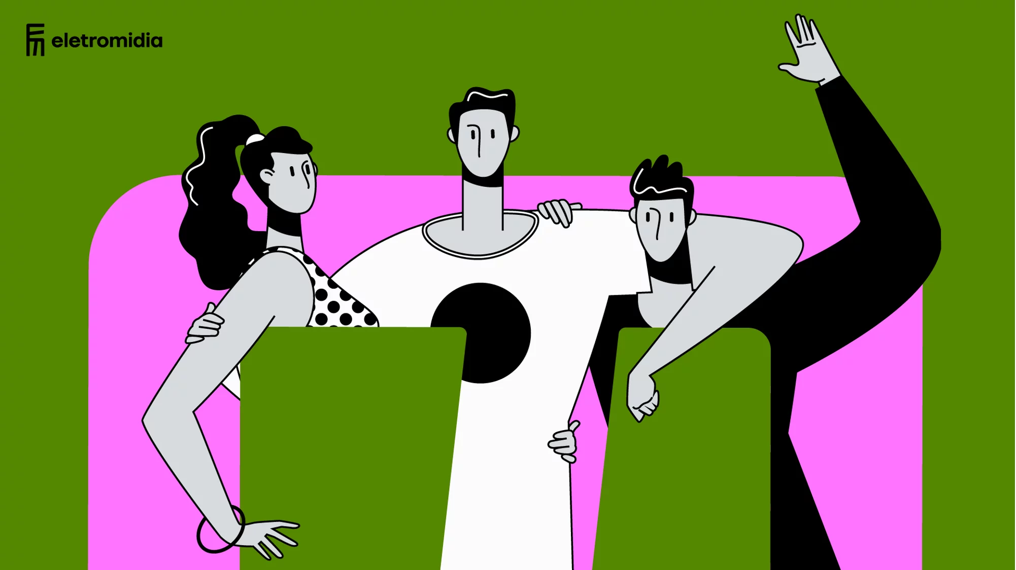
ELETROMIDIA
Branding
Design
Art Direction
Branding
Design
Art Direction
The acquisition of Elemidia, one of the most important media companies OOH, made Eletromidia one of the largest media companies in Latin America.
![]()
To ensure that this merger between the two brands combined the best of both, it was necessary to do deep branding work to understand complementarities, opportunities and issues to be improved.
![]()
In this scenario, we realized that it was necessary to highlight the major differences between the two brands, make the new brand more relevant and present in the lives of its target audiences to build relationships; establish the conversation with the end consumer - and not just with advertisers - as a brand habit; and, finally, create an identity that connects this whole merger with the fact that this brand is present on the streets and in people's lives.
![]()
Given the value proposition and positioning that reinforce the presence on the street, the visual concept could not be otherwise.
![]()
![]()
A symbol inspired by maps and street features, expressing the vibrant and cool side of life on the street.
![]()
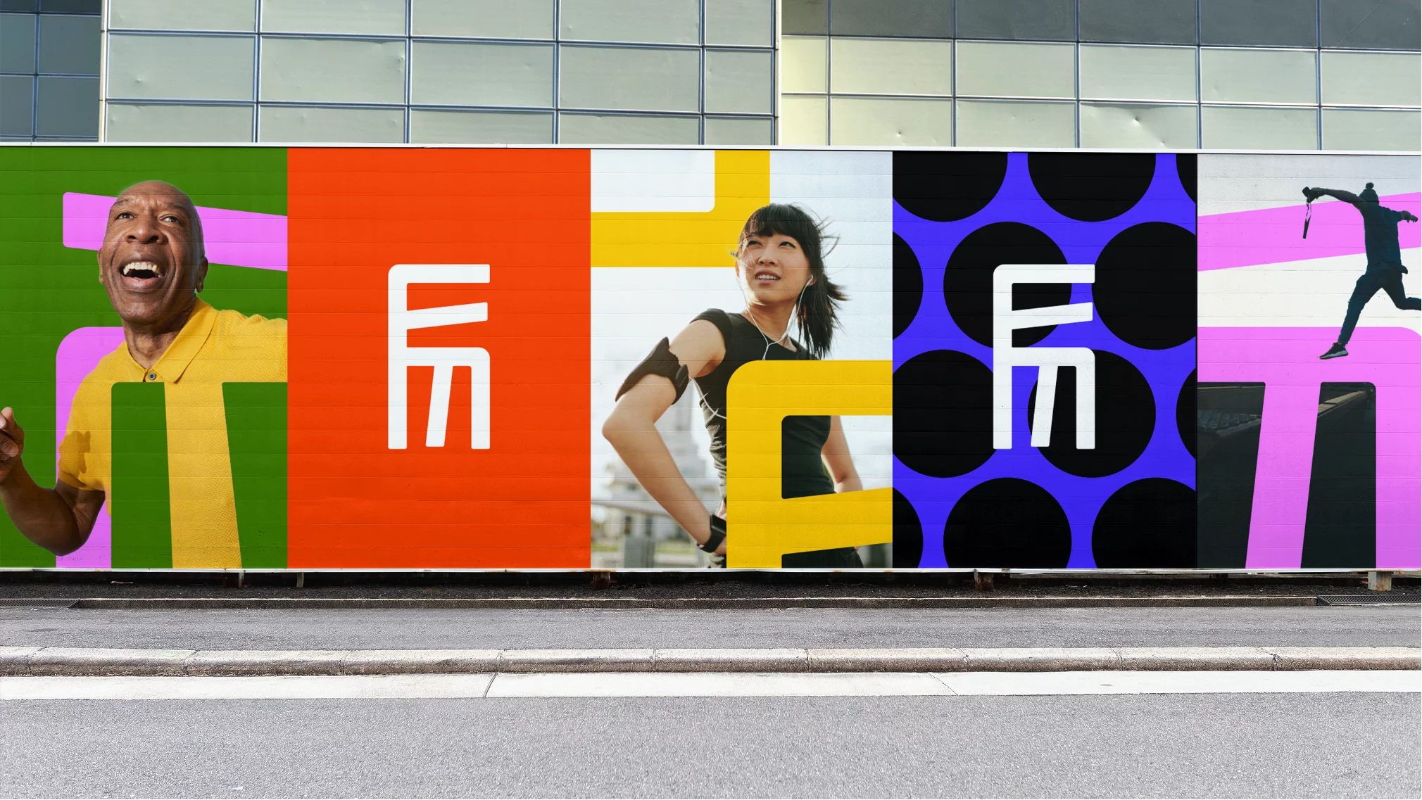
In addition, we used graphics and colors that directly relate to urban symbols such as crosswalks and traffic lights. The designed symbol was created to be used from the brand's assets to lifestyle items such as clothing and accessories.
![]()
![]()
All the strategic and creative work was focused on consolidating Eletromidia as a brand that indeed thinks differently and has the potential to become even more relevant in people's lives, creating conversations and connections with them and also with brands.

To ensure that this merger between the two brands combined the best of both, it was necessary to do deep branding work to understand complementarities, opportunities and issues to be improved.

In this scenario, we realized that it was necessary to highlight the major differences between the two brands, make the new brand more relevant and present in the lives of its target audiences to build relationships; establish the conversation with the end consumer - and not just with advertisers - as a brand habit; and, finally, create an identity that connects this whole merger with the fact that this brand is present on the streets and in people's lives.
Given the value proposition and positioning that reinforce the presence on the street, the visual concept could not be otherwise.
A symbol inspired by maps and street features, expressing the vibrant and cool side of life on the street.

In addition, we used graphics and colors that directly relate to urban symbols such as crosswalks and traffic lights. The designed symbol was created to be used from the brand's assets to lifestyle items such as clothing and accessories.


All the strategic and creative work was focused on consolidating Eletromidia as a brand that indeed thinks differently and has the potential to become even more relevant in people's lives, creating conversations and connections with them and also with brands.
Agency:Ana Couto
Guide Investimentos
ACTIVATION
CAMPAIGN
DIGITAL
ACTIVATION
CAMPAIGN
DIGITAL
The financial sector is one of the most competitive in Brazil. From major banks to brokerage firms, there's always a player vying for the spotlight in managing Brazilian finances. After all, investing is a rapidly growing habit in the country, and no one wants to miss out on this expanding market.
Amidst this competition, every brand wants to appear as the ultimate expert: well-versed in the market, spotting irresistible opportunities, and always ready for any risks.
![]()
Guide didn't want to be just another player. Despite believing in the importance of understanding the market, they always knew that the key is to understand the profile of the investor. With this belief, the brand was ready to reposition itself and find a unique space in the market. Engaging with both those well into their financial journey and those looking for a starting point to invest.
But how do you avoid sounding like just another brokerage trying to get your money? Another self-proclaimed expert on investments?
Instead of being just another voice talking about investments and the market, Guide decided to provoke and question people's relationship with money by generating curiosity without actually promoting products. It offered a unique perspective and a genuine purpose.
![]()
Guide believes that happiness brings money, not the other way around.
Thus, the brand's purpose was born. In a context where life and money seem to be on opposite sides, "guiding people so that money doesn't limit life" has never been more relevant.
![]()
![]()
![]()
The new brand launch campaign, beyond creating awareness, were also focused on bringing a positive impact to Brazilians and their relationship with money. It aimed to make the pursuit of money less burdensome, allowing people to worry less about finances and focus more on their lifes.
![]()
![]()
![]()
![]()
Amidst this competition, every brand wants to appear as the ultimate expert: well-versed in the market, spotting irresistible opportunities, and always ready for any risks.

Guide didn't want to be just another player. Despite believing in the importance of understanding the market, they always knew that the key is to understand the profile of the investor. With this belief, the brand was ready to reposition itself and find a unique space in the market. Engaging with both those well into their financial journey and those looking for a starting point to invest.
But how do you avoid sounding like just another brokerage trying to get your money? Another self-proclaimed expert on investments?
Instead of being just another voice talking about investments and the market, Guide decided to provoke and question people's relationship with money by generating curiosity without actually promoting products. It offered a unique perspective and a genuine purpose.

Guide believes that happiness brings money, not the other way around.
Thus, the brand's purpose was born. In a context where life and money seem to be on opposite sides, "guiding people so that money doesn't limit life" has never been more relevant.


The new brand launch campaign, beyond creating awareness, were also focused on bringing a positive impact to Brazilians and their relationship with money. It aimed to make the pursuit of money less burdensome, allowing people to worry less about finances and focus more on their lifes.


