Unico facelift
Branding
Design
Art Direction
Branding
Design
Art Direction
Unico's facelift project was born out of the brand's need to stand out from the competition and become more scalable and consistent across all user touchpoints.
![]()
It was also an opportunity to create foundations and a visual narrative that translates all the brand's principles and values into a real, strong objective that guides the entire creation:
"Help people find their own identity by changing their relationship with services that improve their lives."
![]()
This means connecting with users in a simple and transparent way, handling people's data responsibly, creating trusting relationships between people and companies, and changing Brazilians' relationship with their data by focusing on education.
All this was translated into our brand manifesto with the help of Tátil Design:
All these improvements to our positioning are also reflected in the way the brand expresses itself verbally and visually. In doing so, we relied on the help of OTO and Doma02 by Plau, who helped us bring Unico to the world:
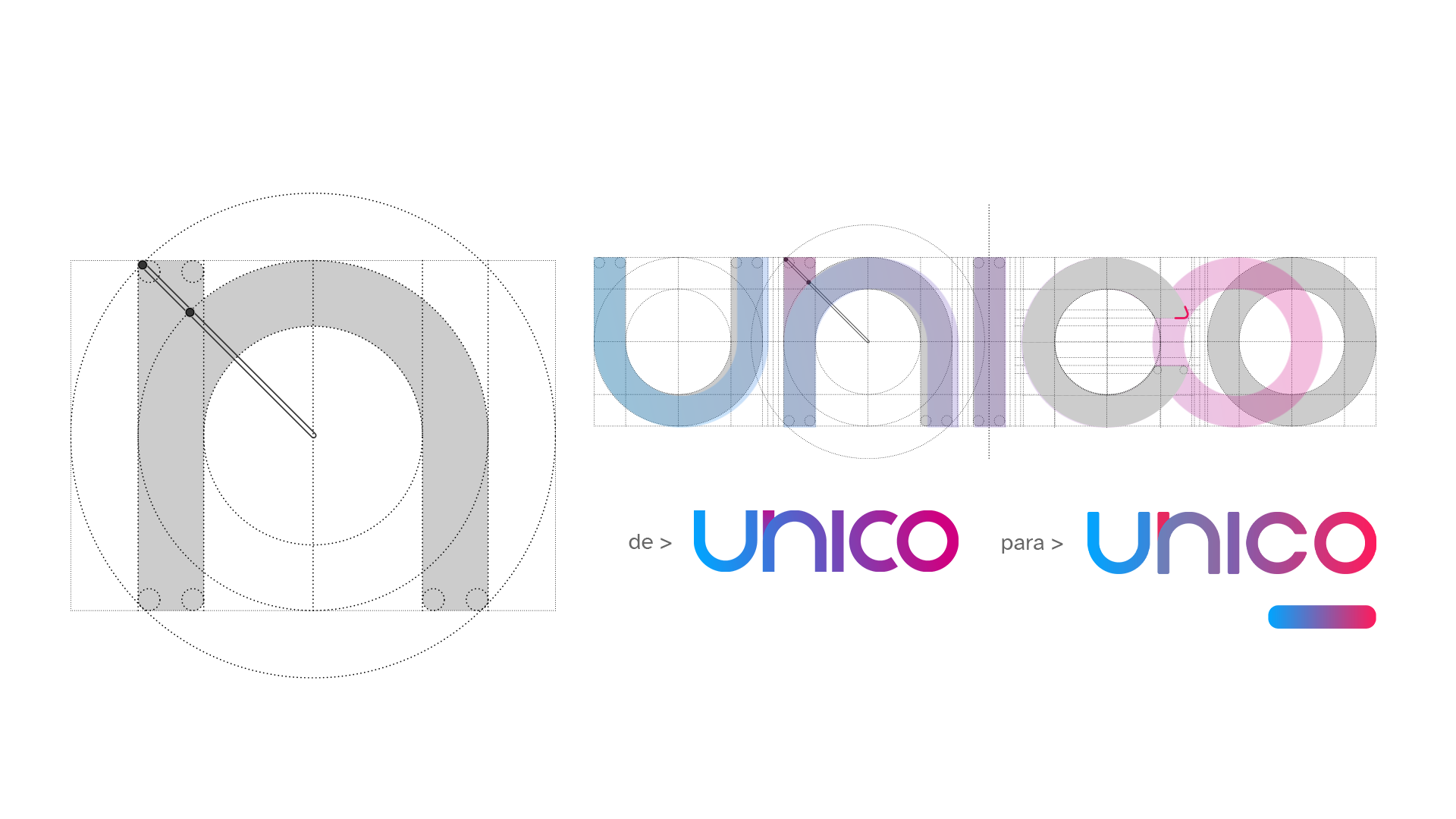
The work on the brand evolution, which went through several phases, was based on a warmer, closer look at a technology brand. To this end, the first phase of this project involved revising our logo.
![]()
We made minimal adjustments to better represent our values and look, a more circular, friendly and balanced brand that puts the user at the center.
![]()
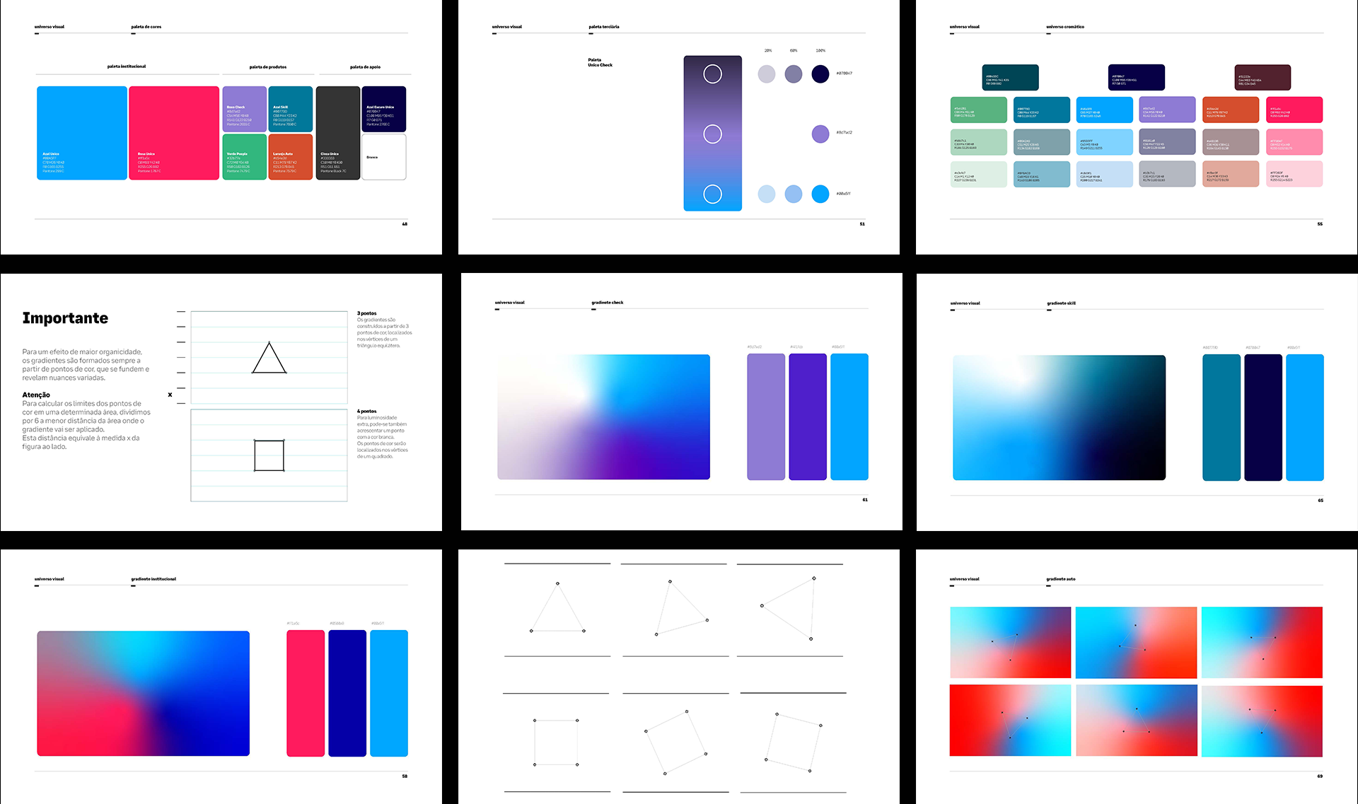
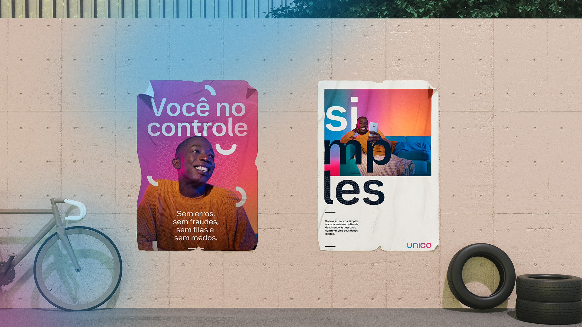
The adjustments in colors and gradients were to create a stronger identification with the brand. We brought back warmer and more pleasing tones to the eyes and broke away from the neon palette that is popular in the tech world. All the colors had a lower incidence of light and brightness, simulating the color and grain of printing on paper.
![]()
![]()
![]()
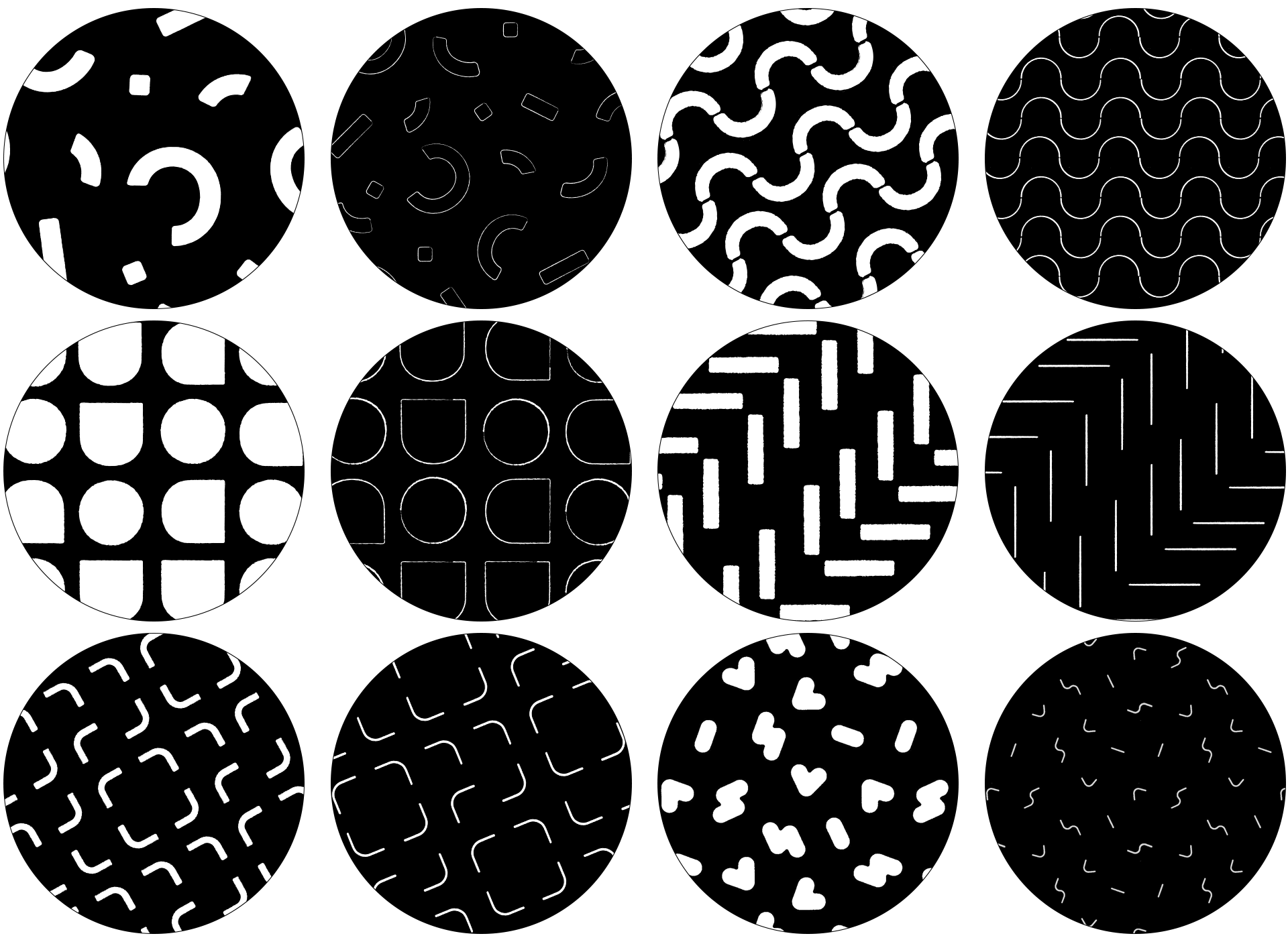
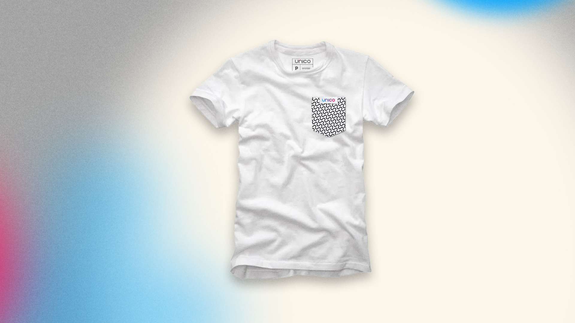
And since our field is security and de-bureaucratization, we took this into consideration when designing our own graphics and patterns. Our graphics save the value and authenticity of the stamp in documents, its lines have natural deformations inspired by the leakage of ink when stamping a sheet of paper.
![]()
Our patterns are inspired by the security lines and watermarks found in banknotes and special documents, such as birth certificates.
![]()
![]()
![]()
![]()
![]()
![]()
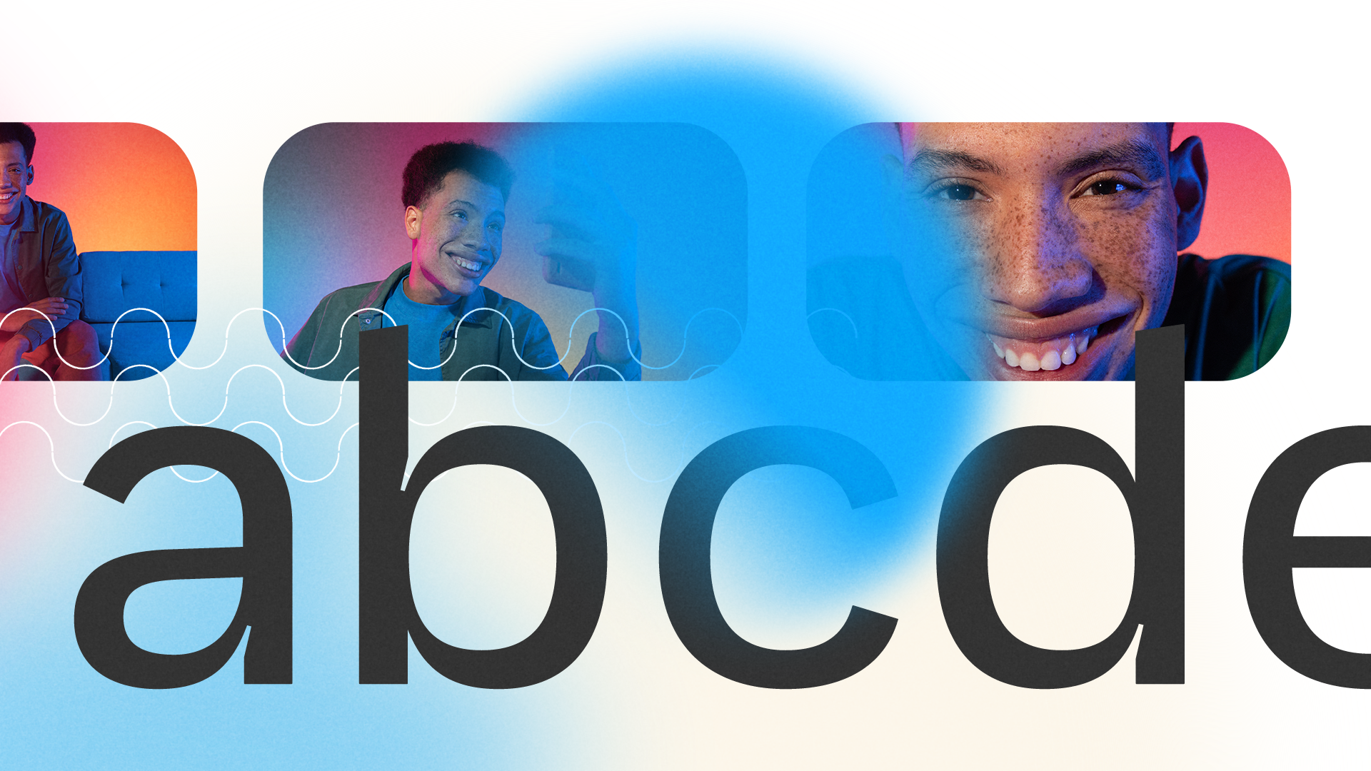
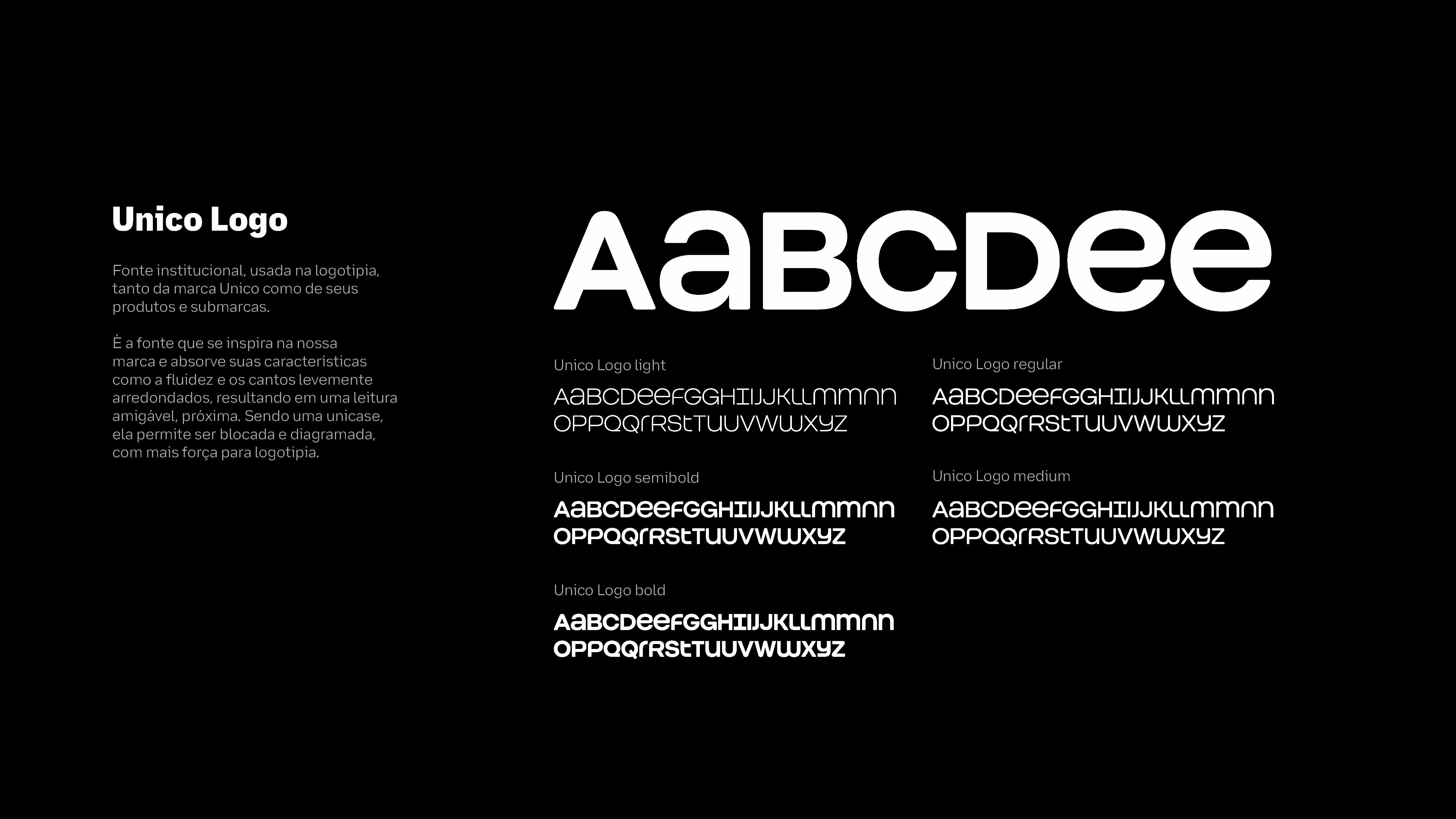
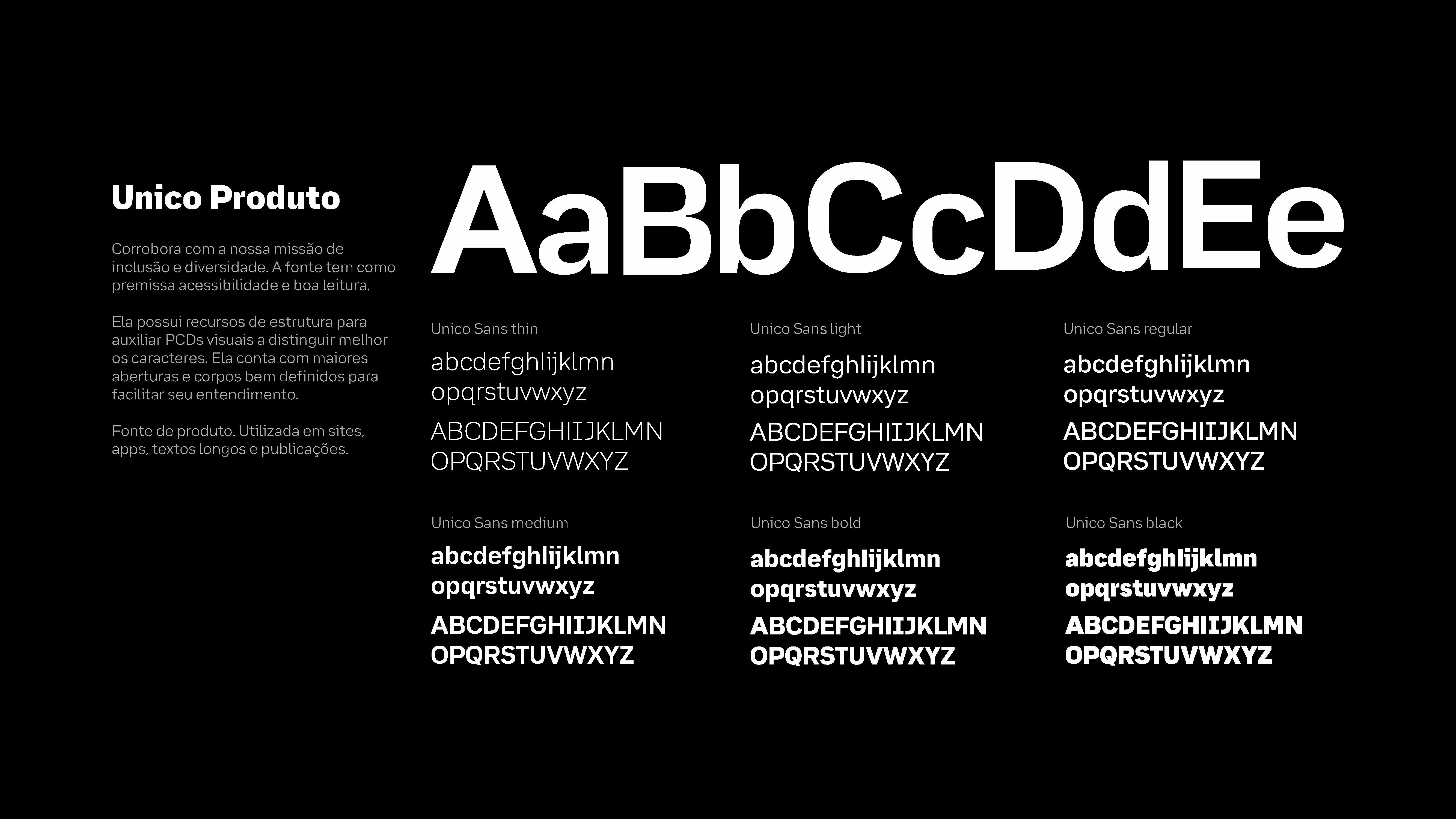
Our type is literally handmade. And it's done by four hands. A project that involved the branding team, the Unico product team, OTO and Plau to develop a proprietary and scalable typeface.
With an eye for accessibility, the entire project was managed to meet minimum legibility requirements while producing a type family with personality.
![]()
Unico Logotipo Font, an exclusive font to reinforce the brand architecture of Unico products through scalability and efficiency.
Unico Display Font, a font that revives Inktraps - a resource that intentionally creates voids in type to avoid the problem of ink leakage in old printers; these voids acted like a natural ink catcher in the paper itself - with much more personality for titles.
![]()
![]()
Unico Product Font , an extremely accessible typeface inspired by Atkinson Hyperlegible, with visual resources to facilitate reading, such as the use of serifs to distinguish similar characters like "p" / "q" and more open angles and well-designed bodies to facilitate assimilation and understanding of the characters when used together.
![]()
![]()
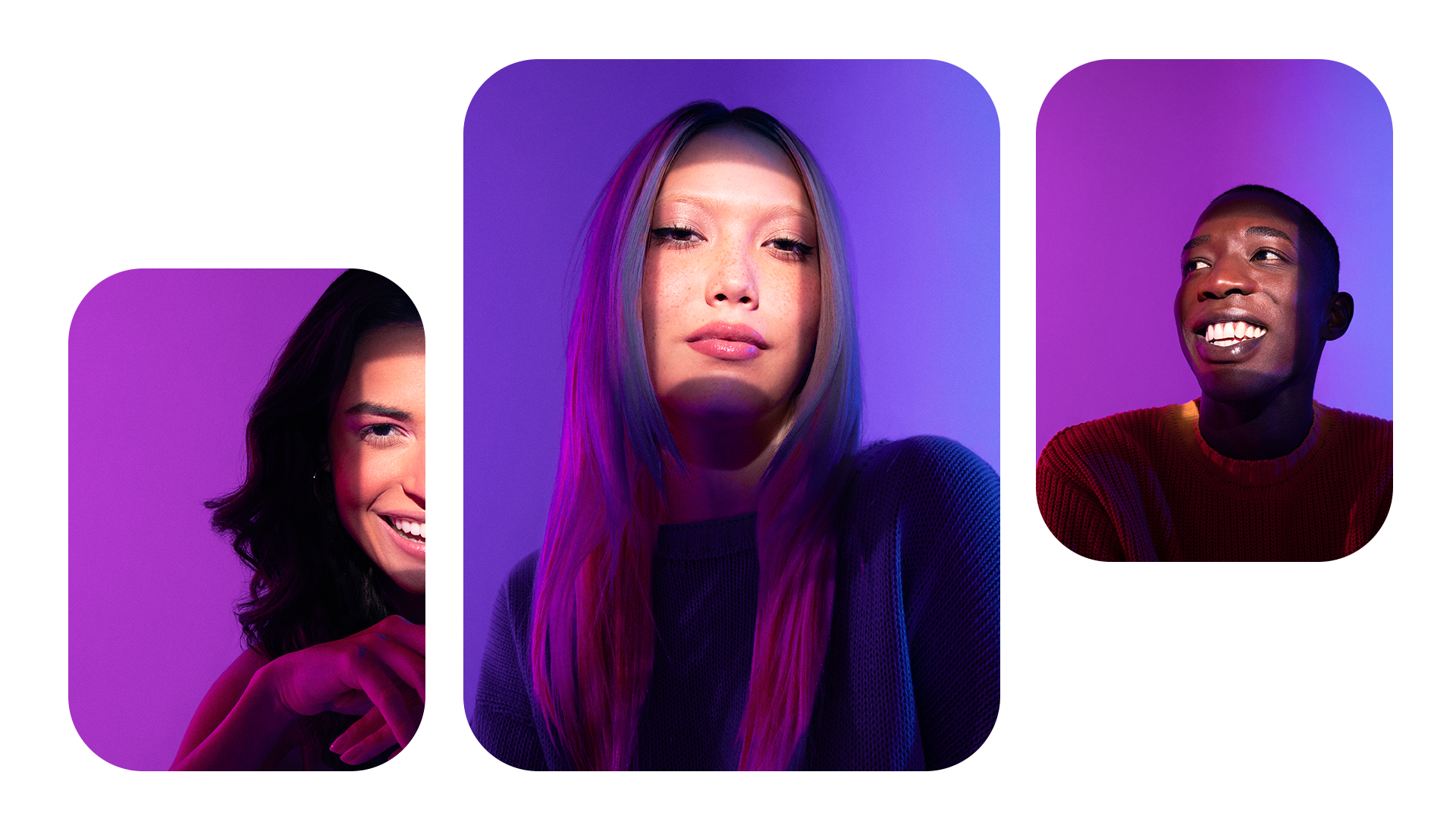
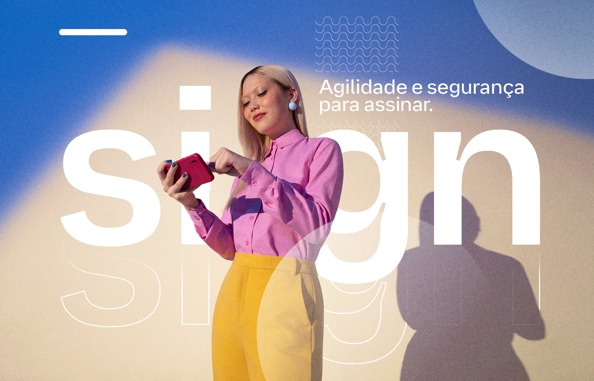
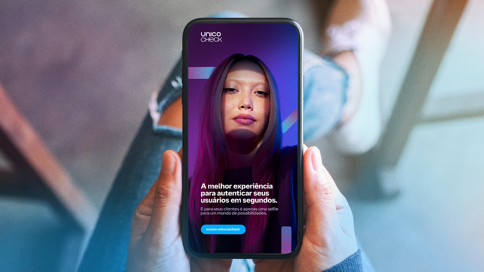
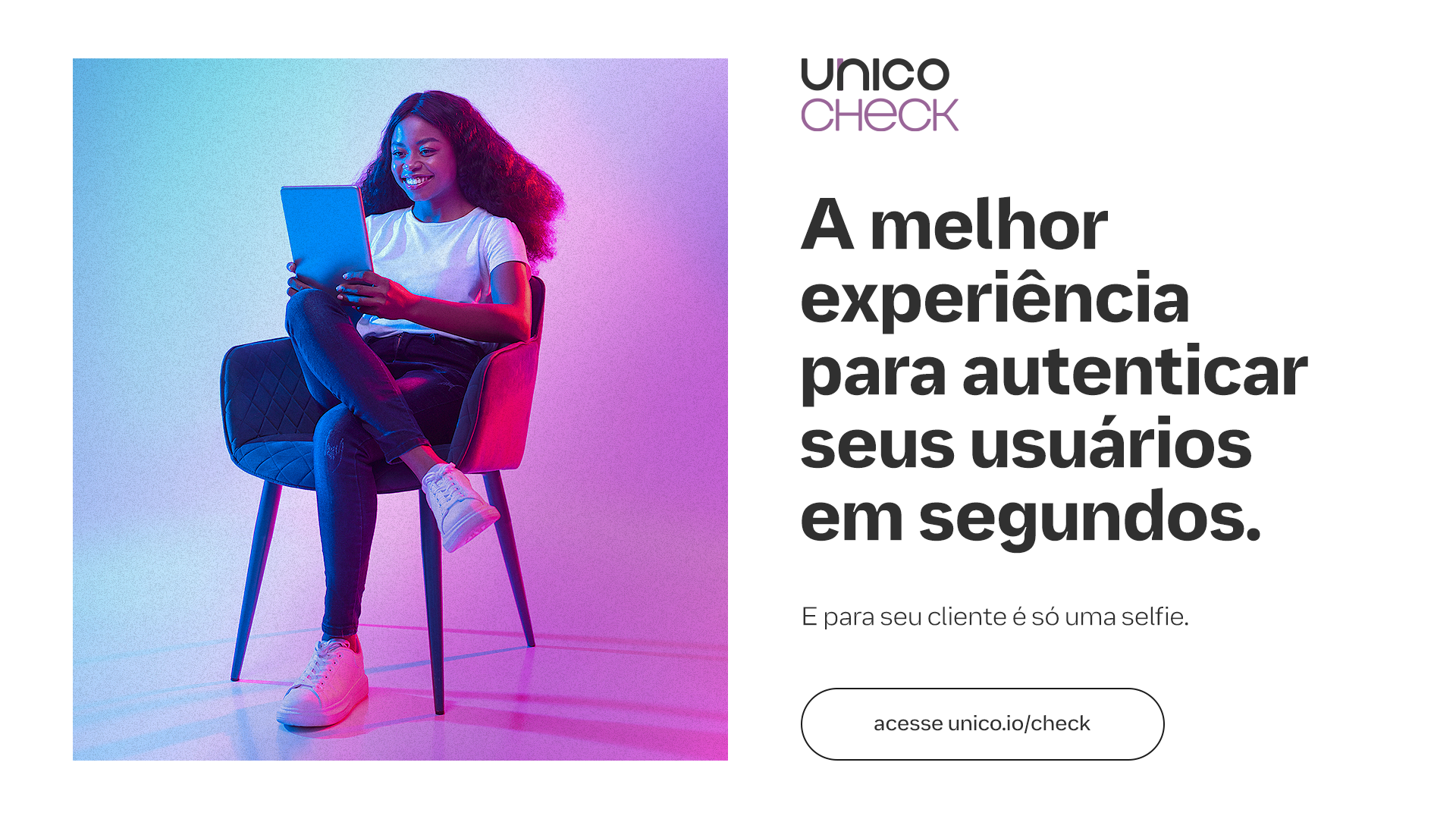
In addition, we also produce our own shooting to transfer our appearance into unique beings. The process of facial biometrics is only possible because this individuality of beings, the distance of eyes and mouth, skin color, shapes and birthmarks, our face is our most complex document. For this, we broke with some market standards and did away with objects and scenarios to tell more by showing less.
![]()
![]()
![]()
![]()
![]()
![]()
It was also an opportunity to create foundations and a visual narrative that translates all the brand's principles and values into a real, strong objective that guides the entire creation:
"Help people find their own identity by changing their relationship with services that improve their lives."
This means connecting with users in a simple and transparent way, handling people's data responsibly, creating trusting relationships between people and companies, and changing Brazilians' relationship with their data by focusing on education.
All this was translated into our brand manifesto with the help of Tátil Design:
All these improvements to our positioning are also reflected in the way the brand expresses itself verbally and visually. In doing so, we relied on the help of OTO and Doma02 by Plau, who helped us bring Unico to the world:
The work on the brand evolution, which went through several phases, was based on a warmer, closer look at a technology brand. To this end, the first phase of this project involved revising our logo.

We made minimal adjustments to better represent our values and look, a more circular, friendly and balanced brand that puts the user at the center.
The adjustments in colors and gradients were to create a stronger identification with the brand. We brought back warmer and more pleasing tones to the eyes and broke away from the neon palette that is popular in the tech world. All the colors had a lower incidence of light and brightness, simulating the color and grain of printing on paper.
And since our field is security and de-bureaucratization, we took this into consideration when designing our own graphics and patterns. Our graphics save the value and authenticity of the stamp in documents, its lines have natural deformations inspired by the leakage of ink when stamping a sheet of paper.
Our patterns are inspired by the security lines and watermarks found in banknotes and special documents, such as birth certificates.


Our type is literally handmade. And it's done by four hands. A project that involved the branding team, the Unico product team, OTO and Plau to develop a proprietary and scalable typeface.
With an eye for accessibility, the entire project was managed to meet minimum legibility requirements while producing a type family with personality.
Unico Logotipo Font, an exclusive font to reinforce the brand architecture of Unico products through scalability and efficiency.
Unico Display Font, a font that revives Inktraps - a resource that intentionally creates voids in type to avoid the problem of ink leakage in old printers; these voids acted like a natural ink catcher in the paper itself - with much more personality for titles.


Unico Product Font , an extremely accessible typeface inspired by Atkinson Hyperlegible, with visual resources to facilitate reading, such as the use of serifs to distinguish similar characters like "p" / "q" and more open angles and well-designed bodies to facilitate assimilation and understanding of the characters when used together.

In addition, we also produce our own shooting to transfer our appearance into unique beings. The process of facial biometrics is only possible because this individuality of beings, the distance of eyes and mouth, skin color, shapes and birthmarks, our face is our most complex document. For this, we broke with some market standards and did away with objects and scenarios to tell more by showing less.


Unico Brandhub com o apoio dos parceiros: OTO, Tátil, Consoante, Plau e Doma02.